|
ITV is one of the major Television channels across the UK, it showcases many shows of different genres to a wide rang audience, It also has different channels such as CITV, ITV2, ITV3 and ITV4. ITV is entertaining, educating and informing and it's specific target audience is all ages from 3 years old to an 80 year old. The corporate identity of ITV is to give out entertainment and vital information, it gives out a good name for itself to the public. The identity over time has changed though as it used to mainly give out news, but now ITV have talked about their changes and their ambition is to turn ITV into a respected, award winning commercial agency with their own on air content. 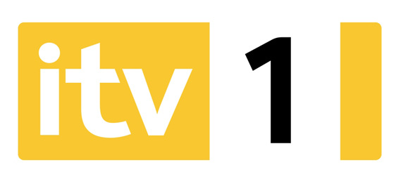 This image above is ITV's old logo which is a bold colour and is neutral to all sexes. The text is bold and on a TV screen it stands out. ITV scrapped the 1 from it and changed the whole design of the logo, below you can see this. The new logo is curved and given a smooth touch compared to the old logo, also colours differ and there is now multiple colours in the new logo which to me says different cultures are now welcome. The purpose of the logo is to stand out and where there is different colours it definitely stands out compared to the first logo. The design being changed to a curve also is a major factor as it's something that you notice straight away and that would've catcher viewers eye. 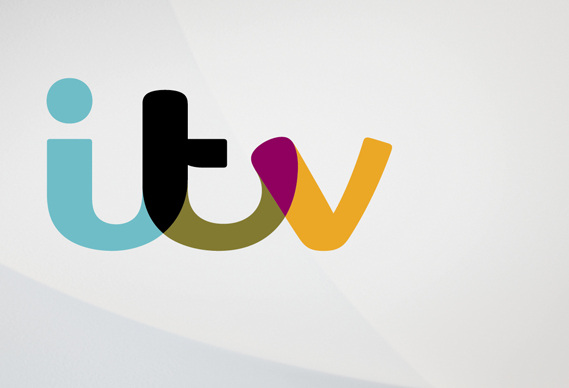 Why did ITV rebrand? Well they wanted to make change the audiences view and their own ambition to turn ITV into a respected, award winning commercial agency with their own on air content. also ITV have said "The rebranding of ITV will allow us to further cement the relationship in viewers' minds between our shows and the ITV brand that produces and broadcasts them," says ITV's Rufus Radcliffe, group director of marketing and research. "We now have a consistent identity across everything that we do, all rooted in our positioning as a media brand that is at the heart of popular culture.” This shows that ITV rebranded so they can give out a more popular culture of shows and that the audiences can have a wider range which brings in a lot more of an audience. I also see that ITV publicly didn't explain their rebrand like the BBC did and do this can be due to them keeping things private compared to the BBC. 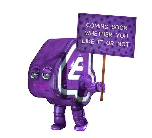 E4 just recently like itv kind of rebranded, they have changed their idents and reintroduced eefer. The robot was the official face of E4 when it launched in 2001 and was an instant hit with almost everyone who worked on creating him.Eefer is a walking, talking robo-celebrity designed to exist on air and in person. From 2001 to 2003, he starred in a series of high profile adverts for E4, which were described by Campaign magazine as being ''mostly fine". And whilst Eefer's personal appearances were less successful, it was generally agreed that when he was kept away from bright lights, alcohol and newsreaders, things went quite well. Then in 2013 e4 announced that refer will return which is very big as comebacks are very very popular. An E4 spokesperson said "Critics have said we're only bringing Eefer back because of a legal dispute, but that's only half true. He's also quite cheap, so let's all just try and make this work ok?" Eefer coming back to the E4 saves money and is easy to create funny idents which will apply to their audience and attract them in. The idents they've made target their audience and their fun, for example the old E4 idents were random and funny and the E4 logo always magically appeared, whereas now there is an animation which is travelling the world and he has an identity to give to E4. 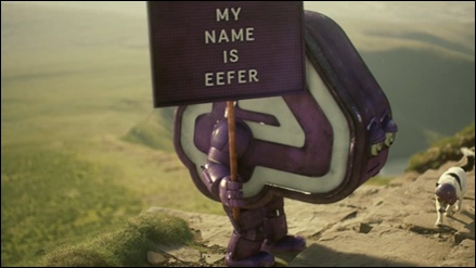 This ident compared to others is very very short and its quite simple. It literally is the nickelodeon logo. The design of the ident is quite clever as its a plain white audience then the nickelodeon logo pops out in its famous orange, The orange is ideal, its completely ideal. It appeals to the target audience which is kids up to teenagers with its funky colour proving that the design of the ident is very important and in this case it works.
The audience as said is kids to teenagers they will remember quick snappy things where as older people would need a longer more say entertaining ident to remember the channel. Due to that target audience being kids to teenagers the design is important and the font being a funky style attracts to the kids and teenagers. Also the colour being a cool orange will attract to the audience. The purpose of the ident is to create and brand the channels corporate identity, it does that well due to the design. Nickelodeon gives off cool kiddy funny vibes and thats what the ident shows. The ident can be very handy as due to it having a just teenager genre they can place it in front of all/ if not most of their shows. All their shows are targeted at a younger audience and with this ident it'd fit in. BBC 1 football ident is one of my favourites, unlike the sky sports one it isn't the same scene. Most regularly the ident used to be played just before a football showing such as match of the day. The target audience for BB1 is the british public of all ages. The style of this ident is a football training drill and it relates to the circle theme that the BBC used to use. The camera is set and focused close range on the players during a slight drill then there is a birds eye view, the design of it shows a circle and the shots used always obtain a circle. The famous BBC1 font and logo is in the design.
The audience is of all ages and to go with circle theme is many other idents in that style, It was vital that bbc1 used a circle as it also linked to the globe that they used to use. The purpose of the ident is to catch the eye of the viewer and stick in their heads to make sure they remember bbc1 and it does that very well with the different shots used and logo use. The genre of this ident is sport yet others vary but use the circle theme, The design of the ident is quite simple where there are different scenes and shots it all comes together in the end and there are different cultures used in it to all come together and thats what the BBC is all about. Sky sports 1 is the home of football, that is what they call themselves. Sky sports show the most live Barclays Premier League football games in the UK and attract many more viewers than BT sport as they get a hold of the big fixtures. The target audience for sky sports is sports fans and for sky sports 1 mainly football fans. The style of this ident is a football celebration and its best suited audience would be Chelsea fans due to the content. It's live footage from a game from the 2013
The camera is set and focused on Jose Mourinho the most well known coach in football and the sound has a slight backing track to a voice saying " sky sports 1 home of football" in relation to target audience it shows passion in football which every fan has. The design of this ident is simple, it's taken from a live recorded game which sky sports showed to an audience. it is in extreme slow motion and is recorded from a touchline view showing they have exclusive content and the quality is good of which the ident is recorded. Its unique as it has a floating sky sports logo in the middle and combined with layers it really makes it stand out as some characters used in it come out of the screen. This shows they are very technical and can make things very interesting. The purpose of the ident is to showcase the fixtures that they will use in the upcoming months to their audience. Chelsea vs Manchester City is one of the biggest games in the world, let alone the premier league and last season saw scenes. The game was played out viciously like all top fixtures and at 1-1 going into the final seconds both teams would settle for a point but Chelsea's Fernando Torres (who at the time was the most expensive footballer in the UK) scored a last minute winner and the whole stadium erupted and they managed to get a shot of Jose Mourinho celebrating, it showed passion, love and desire for football. Thats why sky sports used it. The audience of sky sports are Sports lovers and although sport followings are subject to different teams, the passion in the ident would appeal to the audience. |
Authorwhynot Archives
September 2015
Categories |
 RSS Feed
